
Information visualization is the practice of presenting abstract data — such as time, schedules and assignments — in an interactive diagram using computer-generated graphics to solve problems and manage projects.
 Yingjie “Victor“ Chen, assistant professor of computer graphics technology, specializes in information visualization. He converts abstract data into understandable images. Although simple graphs and tables that display two components of information — the average temperature of each month in a certain location, for example — are common in modern media, Chen’s images are more complex. He combines multiple variables and turns that data into dynamic, multi-node ecosystems of information.
Each graphic created by Chen is as individual as its underlying data, with the resulting images resembling elegant, mechanical snowflakes.
“Design is important,” said Chen, acknowledging the intricacies of each interactive diagram. Because people rely on their eyes for the parallel processing of information — simultaneously distinguishing the color, motion, shape and depth of objects in order to identify objects — vision is our dominant sense. Humans understand images and respond to beauty.
“Our goal is to identify the most simple and intuitive solution,” said Chen. “And we like to create something beautiful.”
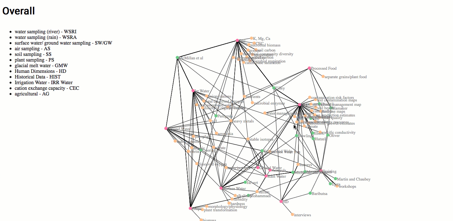
Chen can create a visual representation from any data and for any purpose, and the type of data doesn’t matter. That’s why Carrie Berger, associate dean for research, connected Chen with a professor in Purdue’s College of Science. Timothy Filley, professor of geochemistry and soil science and a founding member of the Purdue Climate Change Research Center, is coordinating Purdue’s role in the newly formed NEXUS Institute in Arequipa, Peru, involving 39 investigators working on 21 different projects. The interdisciplinary teams plan to examine soil types, analyze soil chemicals, audit precipitation amounts, and design and deliver sustainability courses, among other duties. The 39 investigators will be at the study location at different times, needing various equipment to perform their research.
“Tim needed to organize the investigation and he wanted to be efficient with resources,” said Chen. “How could the teams collaborate and share information and equipment? For instance, could someone arriving at the site early in the study perform an additional, unrelated task for someone else who wasn’t scheduled to arrive until later? Examining all these possibilities can save time and money and allow for better planning.”
Chen’s interactive graphic depiction of available resources for the Peru project resembles a cross between a Hoberman sphere and a bouquet of orange dandelion puffs. The pink nodes represent topics, the oranges nodes are individual subjects within the topic, and the green nodes represent the researchers participating in each. See it in action online.
“This is the shining part of the Polytechnic,” said Chen. “We’re not just writing papers about theory. We apply research, theory and technology — and practical design — to solve real problems. And we want them to be easily understood, to help people.”